Finally! The holidays really messed me up for getting this done. I'm over two weeks late. Apologies! I hope to be more timely with the next one.
At some point while I was inking this, I really wanted a castle in there somewhere ... but I just didn't have the energy. There's a little voice saying "a better artist would go back and fix it." But that's when you just say "Shut up you! Finishing things is important too!"
For the rest of the Seated Lady pages, click
here. or
here. Updated weekly (generally).
I decided to throw together a little tutorial about how I did this page. It's mostly just a series of work-in-progress shots, but I'll try to explain a bit more of what I'm doing as well. I probably should have made a tutorial with a page that had more than one panel to it, but oh well. Next time.
I do the following steps for all the Seated Lady pages.
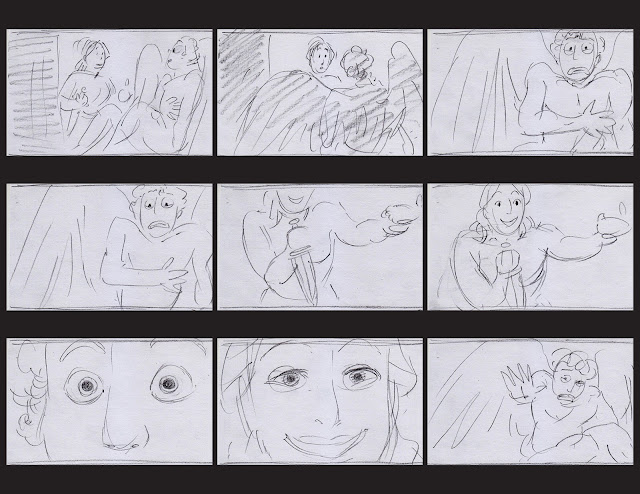
1. Thumbnail Sketches
First I thumbnail the page on paper (very small : 2.5 x1.5 inches).
For a more complicated page with more panels, I'd do more sketches. For this page I mostly knew what I wanted, so I just made one sketch.
2. Rough Guide and Masking
After thumbnailing, everything else is done in Photoshop CS5.
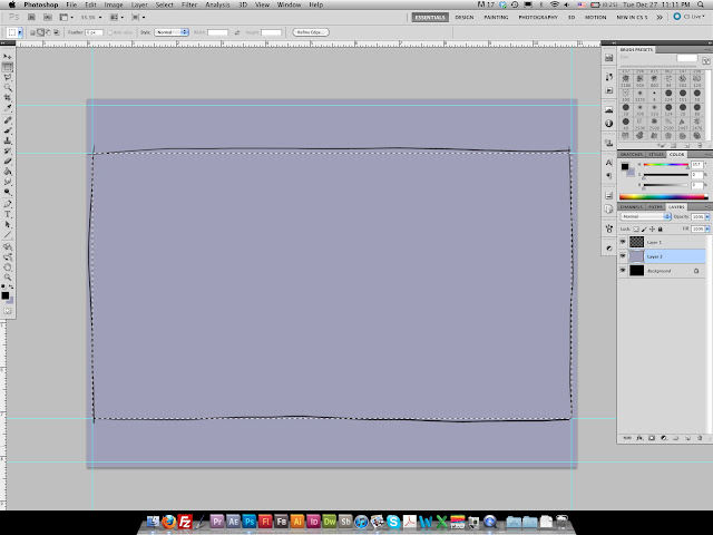
I create a new document, 8.25 x 11 inches, 300 dpi.
The background layer I fill with black. Above that, I make a layer and fill it with this purple. All the pages have this color as the base.
On another layer, I roughly draw in where and how big I want the panel to be.
I use the guides to exactly demarcate the top, bottom, left and right edges of my panel.
Then I use the Rectangular Marquee Tool (with snapping on) to create a selection exactly within the boundaries of the guides.
Next I select my purple layer, and hit the Add Mask button at the bottom of the layer panel. This automatically creates a mask so only the area I had selected is shown. The black of the lower layer shows through.
3. Rough Drawing
Next I do a rough sketch of the whole composition. I try to stay zoomed out as much as possible so I maintain a good sense of the scene as a whole.
I use about a 6 pt brush with pressure determined opacity.
3. Drawing
Next I do the drawing. At this point, I'll start to use separate layers for the different elements, such as the girl or the castle walls. I might also zoom in a little bit. But ultimately, I still try to keep loose and allow for spontaneity so the drawing has energy. If one element is particularly tricky, I might even do another drawing layer before inking.
4. Inking
Next is inking. I use the same brush I used for sketching, but without any opacity change. A solid black line. The brush I use has 85% scattering to give the edge of the line some teeth, like a real pen might.
Unlike most of my other pages, I used a wide variety of brush sizes for the different layers of the composition. I used a 6pt brush for the girl and the foreground, and then went all the way down to a 2 pts for the distant mountains.
I really like the way Shoomlah inked with Photoshop in her Cinderella tutorial. She uses bold, flowing strokes, but separated on different layers, so she can easily erase the excess bits without hurting other lines. So I've gotten into that habit and I like it a lot! It makes for a lot of layers to manage, but I usually collapse them as much as possible as I move on from one area to another.
5. Coloring
Coloring. I roughly throw in colors on the scene using a textured brush. I put all the color layers within a folder beneath the inks layer. I use the same mask on the colors folder as I do on the purple layer (step 1), so that the colors stay within the panel*.
I've already worked out my color scheme for this part of the comic. You can see it on top of the above image. I will try to explain how I come up with my color schemes in another tutorial. I also use the eyedropper to select colors from previous pages.
*an easy way to copy a mask is to right click on the first mask and select Add Mask to Selection. Then select the other layer/folder you want to have a mask and press the Add Mask button at the bottom of the Layers panel.
Once I'm generally satisfied with the color scheme, I zoom in and clean up my coloring work.
At this point, I do not try to think about highlights and shadows. I try to keep the colors as uniform as possibly. I will work on adding values in the next step.
6. Texture and Values
Next I do the texture and values. I create another folder above both the color folder and the inks folder. Again, I mask out anything that's not my panel so it stays nice and tidy.
In this new folder, I import a black and white texture file. Like a paper texture. I set the layer to an opacity of 33% and set the Blending Mode to Multiply.
I also create a mask for this layer. Using the mask, I remove some parts where I don't want the texture to show, such as on the girl, or the sky.
After that, I add a bunch of layers to define the values. I use alternating layers with Blending Modes set to Multiply and Overlay to define the shadows and highlights, respectively.
For this part of the story, I use a desaturated, bright orange (warm) for the shadows and a somewhat mid-value, desaturated cyan for the highlights. For really strong highlights, I will lighten the blue.
For this page I used eight layers total, 5 Multiply, 3 Overlay. I kept adding them back and forth as needed. I didn't make screenshots showing the buildup of value layers, but I'll try to do that for the next tutorial.
7. Color Linework
Next I color the linework. To color linework, you select the layer you want to color, then click the Lock Transparent Pixels button in the Layers panel. With that selected, you can draw anywhere you like and it will only effect where there are already pixels. That way you can take broad strokes and color in the lines very quickly. I found that out not too long ago. Pretty neat eh?
How do you choose what color to do the lines? I like to color the linework after putting in the values because I want to choose colors that will make the lines better blend into the scene. My general principle is for the ink color to be darker and more saturated than the main color. For example, for the horse, I would sample the darkest value on the horse's body, then slightly darken the color and greatly increase its saturation.
8. Add Border
Finally, I add the border. I draw with the guides (from step 1) visible, so the drawing snaps to the guides and the lines are straight.
I also added a few final touches, like the motion lines around the girl, and the mist in the background. Then I call it finished!
I hope this has been helpful! If you have any questions, let me know!


